Ordering Made Easy: Exploring Architecture and Interior Design

January 13, 2026

I tried to purchase coffee on the order screen at McDonald’s yesterday. After three attempts at pushing the wrong buttons, I got it right. But it took more than twenty screen taps to get my simple order. To start with, choices were “here or takeout”; then pick one item from dozens of food and drink options; then “hot or cold” from numerous drink choices; then coffee size – three options; then what to put in the coffee; and then pay on the screen or at the cashier. I mean, I could have ordered it verbally by saying, “Small black coffee, please.” Four words. No matter. The screen works for all orders, and the more screens there are, the more people can order simultaneously.

I still prefer to speak with someone when ordering; I prefer a social interaction. As a result, I often end up at Starbucks or Tim Hortons, where one must order by speaking with a barista or server.

Surprisingly, there were many middle-aged people at this outlet next to Algonquin College in the early afternoon. I expected more students instead. And the people occupied the seats around the perimeter, sitting at tables for two and four, leaving the large communal tables in the middle of the restaurant empty.

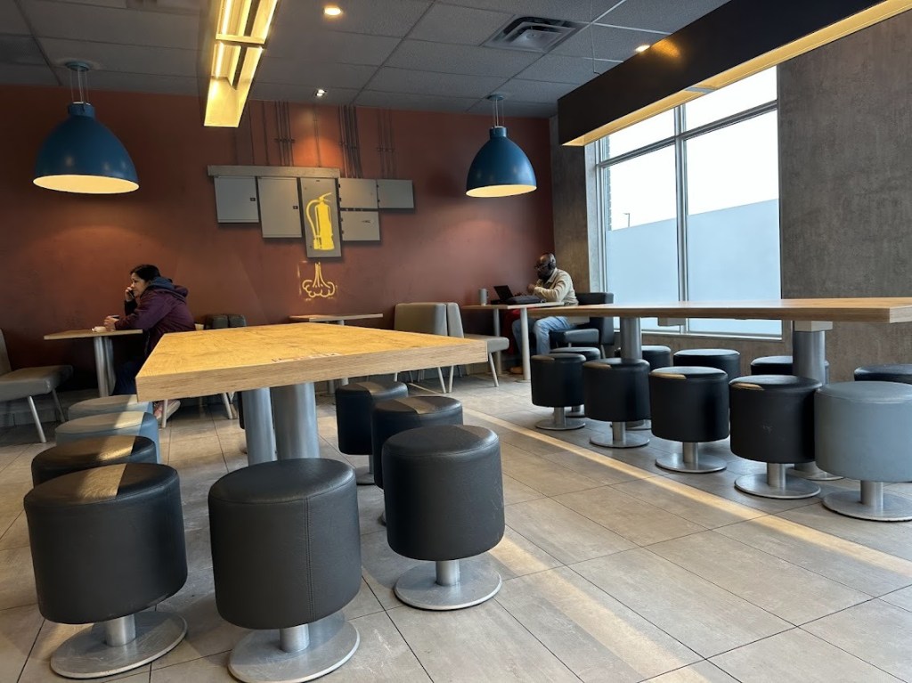
Yes, I read that McDonald’s new interior design, called Luna, was developed by an Amsterdam consultant. According to the architect, the design concept encourages socializing, saying hello to people, and facilitating conversations. That is the theory, although I did not see people greeting each other and engaging in conversations.

The Luna design concept features large communal tables that are high and surrounded by barstools, as well as smaller tables around the perimeter. There are 10 or more stools around each large rectangular table. I did not see anyone sitting at these tables. But the furniture design and the colors were pleasing. The walls are painted brown, interspersed with grey accents. According to the designers, it is a subdued atmosphere with no bright colors.

And I did not see a children’s play area, a space I had seen years ago at many McDonald’s outlets. Clearly, McDonald’s moved on to cater to an older clientele. It may be a response to demographic changes, or the older age group may be financially better able to eat there.

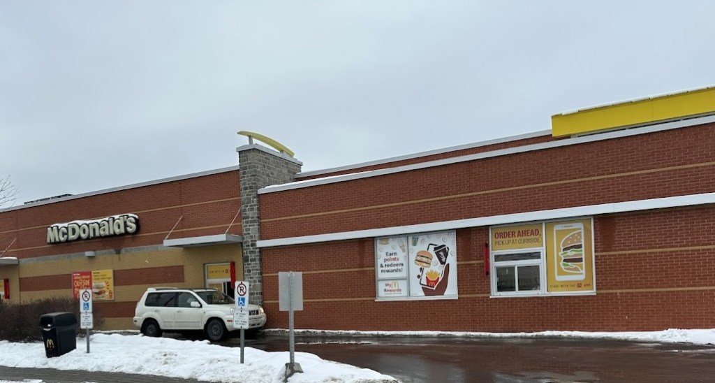
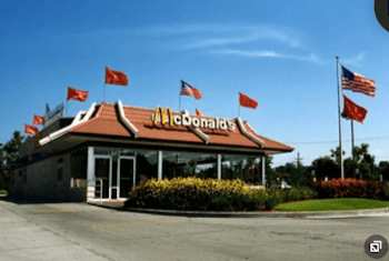
I remember the original McDonald’s, with its huge Golden Arches to catch drivers’ attention on the highway. Then the company decided to blend the architecture into the residential areas, perhaps encouraged by zoning bylaws, coming up with the Mansard roof, which blends into the neighborhood. And now, the buildings seem to be simple rectangles, with the logo still intact and small Golden Arches along the fascia. These buildings could just as easily be office buildings, such as medical or insurance businesses. I saw how easily these McDonald’s structures could be converted into offices should the neighborhood’s demographics change and the outlet lose business.

I like the new interior designs, though not so much the exterior; the buildings are boxes with dull colors. I don’t know how the designers arrived at designing such boring buildings. Did they envision a plain, innocuous look that would correspond to the challenging economic and political conditions of the last few years, combined with the recent Covid pandemic?

However, I find McDonald’s an attractive stop on the highway, as their food quality is consistently good and they have kept their menu items up to date to satisfy regional tastes. For example, they offer sausage gravy in the southern states. I always look for sausage gravy, a favorite of mine, and I had some at a South Carolina McDonald’s that was excellent. Now, I am not commenting on the nutritional value of their food; that is a different issue.

I make stops at McDonald’s whenever I’m traveling on the highway. But it is certainly not equal to home-cooked meals in terms of nutritional value or compared to a comfortable home environment. But boy, is it ever tasty to chomp into a Big Mac with fries, occasionally? Despite the calories and fat!

My Impressions of Three Frank Lloyd Wright Houses

December 1, 2024

Frank Lloyd Wright’s Martin House in Buffalo, built in 1904, would inspire any young man seeking a career in architecture (Darwin Martin was the CEO of the Larkin company). Stepping from the entrance porch, sheltered by a low overhang, into the lobby with a much higher ceiling conveyed a sense of warmth as if coming in from the cold outside. A massive fireplace dominated the right side of the lobby. A pergola, visible through a stained glass window, pointed towards the coach house. Entering, the lobby was dark with the surrounding walls made of sculptured stonework, using local materials.

The house layout was logical and straightforward; the reception room for entertaining guests opened on the left of the lobby. On the right was a large and extended room divided into the dining area, the living room, and the library at the other end. What gave elegance to all the spaces were windows all along the walls facing the outside, with colored patterns embedded in them. The windows illuminated the rooms and allowed occupants to view the surrounding landscaping designed for viewing from inside. Walking through the rooms was very comforting; I wanted to sit in the living room and enjoy the view through the windows.  

FLW was a total architect, designing not only the outside but also the inside of the house with most of the furniture, sometimes conflicting with the client’s wishes. For example, he created the bed for Mr. and Mrs. Martin in the main bedroom. It was esthetically pleasing but so short that Mr. Martin remarked that he could use it only while lying diagonally across the bed. Mrs. Martin had real trouble with the bed and decided to move to another bedroom with a larger bed in a few months.

Another example of the architect pushing his ideas was the grand piano the Martins wanted in their living room. FLW demanded that the piano be made of a specific wood to match the room’s color scheme. The piano would have taken a long time to manufacture and was so expensive that the Martins decided to buy one from a store, ignoring its color.

The design of the library floored me, I didn’t see any books. The books were in casbinets, designed by the architect, that swiveled to provide access to the books. It also surprised me that the library was furnished with a large table in the middle, against which were two bench seats facing away from the table on opposite sides. It seemed as if the architect did not want people to face each other when reading.

Impressed by the Martin House, we saw another FLW design, “Fallingwater,” a summer home for the Kaufman family of Pittsburgh, of department store chain fame. Fallingwater is one of FLW’s best-known designs, with a waterfall running through the building, built in 1936. Expansive balconies overhang cascading water; used in a famous building picture. The Kaufmans had one son, and the humongous living room was the most striking impression I had of walking through the summer house, created for only three adults. It was a vast open space with a few chairs and a massive balcony up front overhanging the waterfall. Windows covered three sides of the room. Against the back wall was a dining table of ordinary size with four chairs dwarfed by the oversized living room.

After seeing the main level of the house, the guide took us upstairs. Curiously, the staircase leading to the bedrooms had bookshelves; I understood that the son loved reading and insisted on having open bookshelves along the stairway and in his room, a design the exact opposite to the one in the Martin House library. However, his creative furniture design was evident in all the rooms; FLW designed a lamp for the night tables next to the beds with a vertical V-shaped wood construction that could be swiveled to throw light on a book when one read in bed. Equal attention was paid to window design; corner windows could swivel to open to let in air from two sides of the house and let the sound of the waterfall in from below.

In contrast to the two large houses designed by FLW, the Martin House and Fallingwater, we visited a 2.100 square foot Kentuck Knob, close to Fallingwater, also designed by him. The project was built in 1956 for the Hagan family for $90,000, who made their fortune in the dairy business.

The critical elements of the typical FLW style are all here: the house growing out of the land, situated to take advantage of the landscape, bringing natural elements into the house, and using local materials. It has long horizontal lines with a large overhanging roof. However, the design style has changed; the house has hexagonal instead of rectangular rooms. Designed by FLW, a long bench runs along the back wall of the elongated hexagonal living room, facing a window wall that overlooks the valley below. Sitting on the bench provides an excellent view of the panorama below. There are a couple of uncomfortable-looking chairs designed by FLW in the otherwise empty room. The long bench along the back wall was bizarre; would ten people sit side by side to watch the view in front? Not likely. A living room for me conjures up arrangements of chairs in a circle or in small groupings, where intimate conversations could take place.

Extending from the living room along the window wall, the dining room provides access to the kitchen and bedroom wing. The hexagonal kitchen features a twelve-foot-high ceiling and a skylight. The original design for the kitchen did not please Mrs. Hagan, who was an excellent cook and liked cooking meals (there were no servants in this household) and insisted that the kitchen be enlarged. The redesign narrowed the hallway connecting the kitchen to the bedrooms. The idea crossed my mind that FLW did not cook and did not have a high opinion of women to design such a miserly kitchen, especially without an outside window. That would be standard today.

Kentuck Knob is now owned by Lord Palumbo, a British property developer from London, England. Even at 89, he still visits the guest house on the property for a month every year. Today, according to our guide, this building, with a market price of three million dollars, would cost one million dollars to build. Kentuck Knob is meticulously maintained and in excellent condition, operating as a tourist attraction.

These buildings, and others designed by FLW, are national treasures, the product of arguably the most talented American architect. The architect’s ability to seamlessly integrate the last two buildings into the hillside, while capturing the best views of the surrounding countryside, really impressed me (in contrast, the Martin House sits on a suburban lot). The architect’s meticulous attention to detail, designing everything from the exterior and interior to the furniture, really impressed me.

Designing all the furniture came with some consequences, though. All three houses had surprisingly small bedrooms. As a result, the architect’s design, which included beds, nightstands, and built-in cabinets, made it impossible to use any furniture from the previous home. It’s not surprising that FLW’s strong personality caused friction with some members of his clients’ families.

FLW’s clientele consisted of three wealthy businessmen, all of whom had attained success in previous endeavors. Do people living in architecturally stunning homes experience greater success and happiness? We don’t. know. The only thing we know is that it was expensive to hire a renowned architect. After comparing architect-designed houses to basic shelters during my travels in Asia, the Middle East, and South America, I noticed that most people live in simple homes, making the field of architecture seem not so important in a global context.